Sharing is caring, so I thought I’d share my current workflow for Photoshop. I’ve been using Photoshop since 2002 or so, and to be honest not much has changed. The program itself has become a powerhouse for editing photos, but most of the functions have pretty much been around for over ten years. So while there have been small changes to my workflow, the basics still stand. I never took a class for Photoshop, but read a few tutorials here and there (this was before Youtube) and then played around with the menus until I found what worked for me.
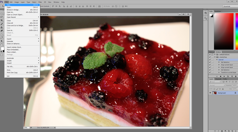
I like to begin by creating a new file (File> New). This lets me edit a photo without changing the original. The last thing you want to do is resize an original file and then later find that it’s too small to print.
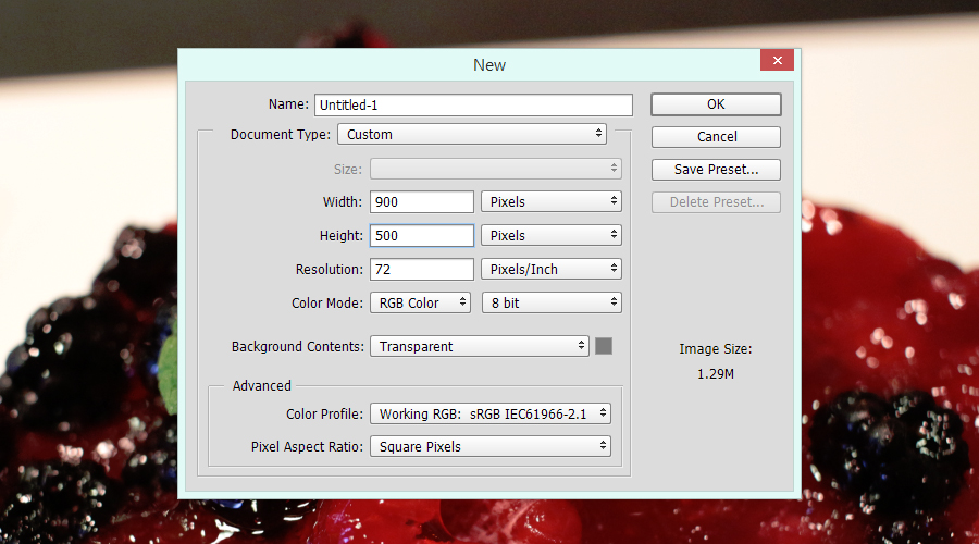
One thing I like to do is to keep all the photos for my blog posts a fixed image size. I think this gives a clean uniformed look to my blog posts. So find an image size that you prefer and try to keep using that image size for all your photos. I prefer a widescreen look, but you could equally use images that have a bit more height. I use a resolution of 72 for my blog post images, but you need a higher resolution for printing photos (another reason not to change the originals). Finally, I prefer to keep my background transparent. The default gives you a locked white background that you don’t really need for editing photos.
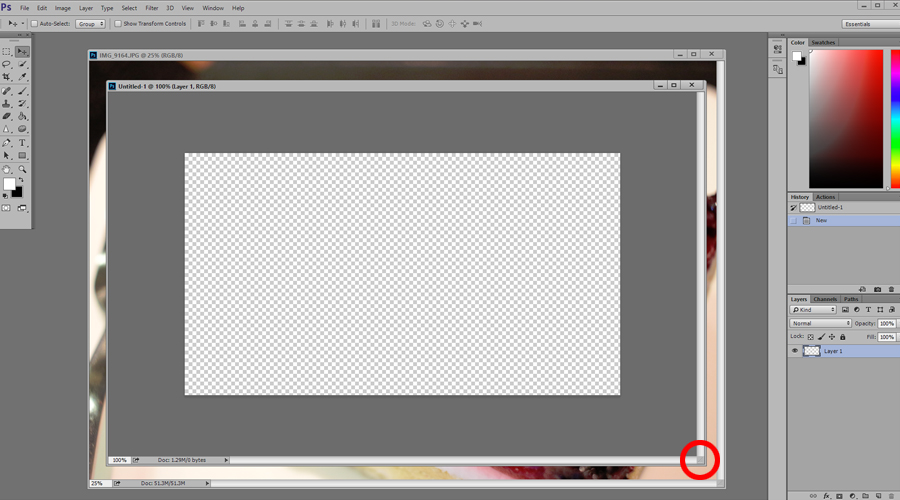
Hovering your mouse at the corner of the file will change your cursor to a diagonal arrow for resizing the window. This will give us some room to work with when we scale our photos.
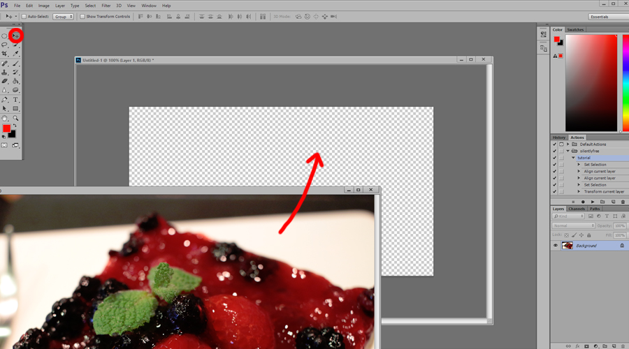
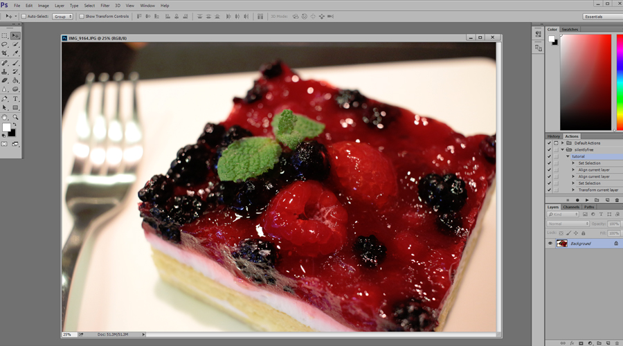
By default you should be using the Move Tool when you first open Photoshop, but if you’re not, select the Move Tool in the tool box at the top left. Then click on your photo and drag it to the new file we created. Alternatively you can Select All (ctrl + a), Copy (ctrl + c), click on the new file and Paste (ctrl + v). Now you can go ahead and close the original photo. If it asks you if you want to save changes, click no.

Select All (ctrl + a) then hit the two buttons that are circled in red in the top menu bar to align the vertical and horizontal centers. This is so that when we resize our photo it won’t resize somewhere off screen. If your menu bar has different icons it’s because you haven’t selected the Move Tool in the toolbox on the left. Deselect All (ctrl + d).
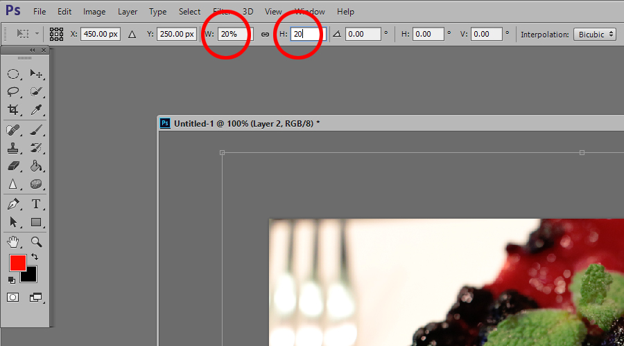
Transform (ctrl + t). In the top menu bar change the W and H percentage to 20. You can also try 15 or 30 or even 50. It depends on how big your original photos are, and how big you want your blog photos to be. Play around with the number. You’re not trying to find the perfect size yet, you just want to be able to see the transform handles so you can adjust them. This is why we made our file window bigger earlier. If a ruler popped up around your window, it’s because you pressed (ctrl + r) on accident. Simply press (ctrl +r) again to get rid of the rulers.
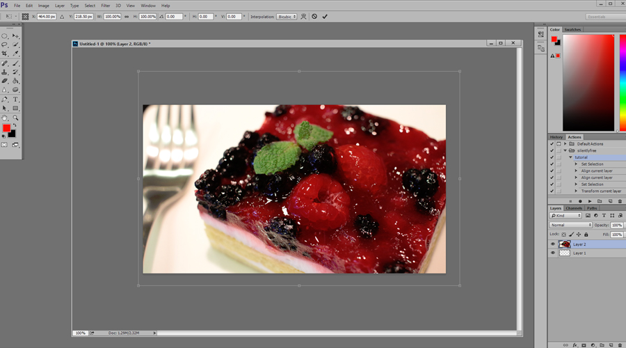
Now you can move the photo around and use the handles to resize it to your liking. When you’re moving the handles hold down the ( shift ) button so that the size ratio doesn’t change. You want to avoid squashing your photo! If you hold down (alt + shift) it will stay centered while you’re resizing. This can come in handy if your photo composition is already to your liking and you just want to resize and retouch. You can also click and hold down to move the image around; a chance to reframe your photo and fix the composition!
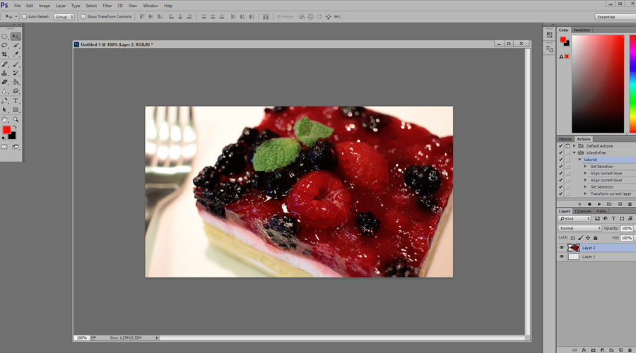
Once it’s sized and framed to your liking, press (enter). If the lighting and color is set then all you need to do is save the file.
Tutorial for File Handling & Prep
Tutorial for Retouching Photos
Your turn ♥ What is your favorite photo editing trick?
