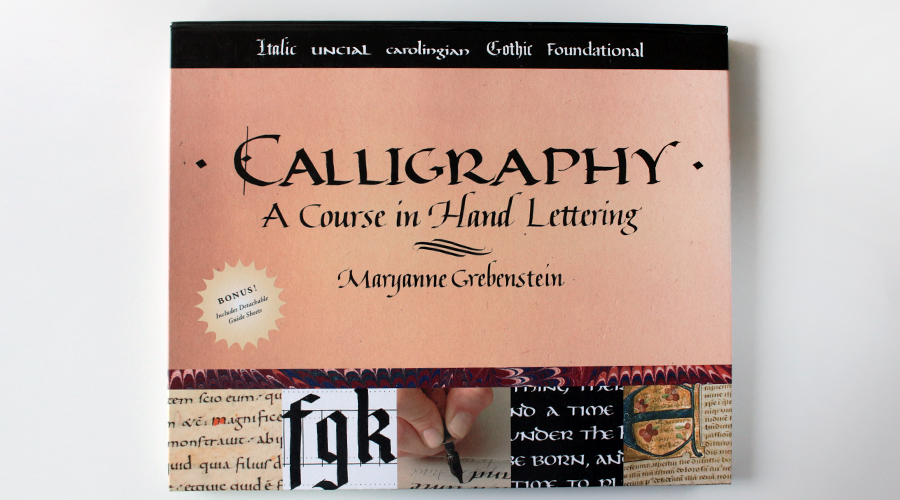
If you’re completely new to square edged nib calligraphy such as Italics or Gothic, I highly recommend the book Calligraphy: A Course in Hand Lettering by Maryanne Grebenstein. This book doesn’t go too much into technical details, but it’s the perfect book to try out calligraphy with training wheels.
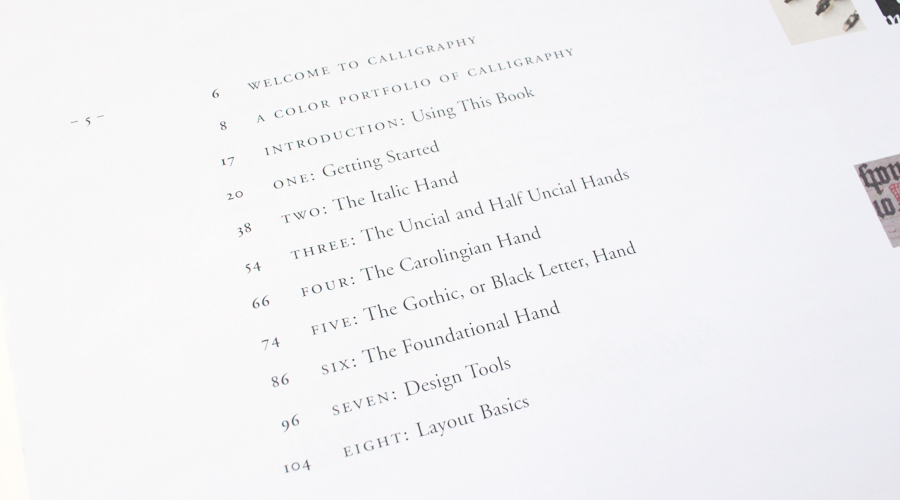
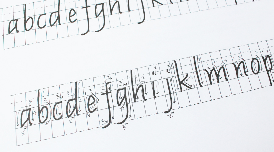
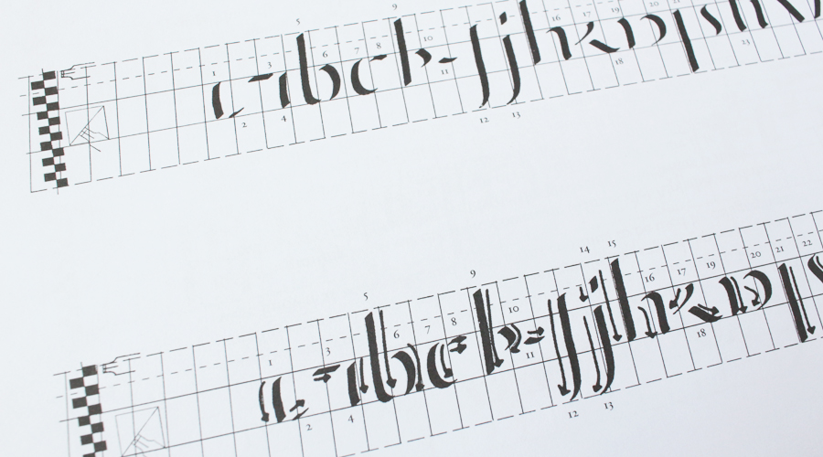
The first thing I like about this book is that it goes through the order of all the strokes one by one. Because it gives you small steps to work with, you’re less likely to get overwhelmed and discouraged when you’re first starting out.
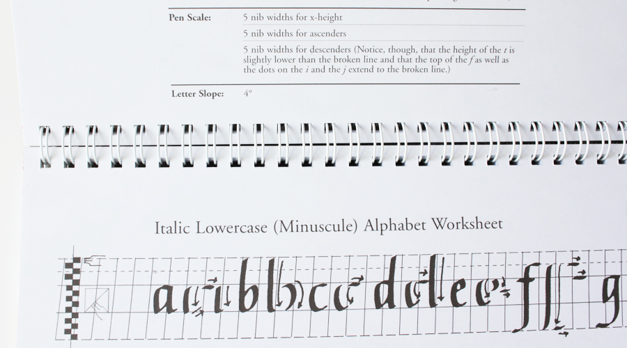
The second thing I like about this book is that it has a table that tells you clearly what the angle of the letter slope is (how tilted the letters are), and how many nib widths are used for the x-height, ascenders, and descenders. At the end of the book it has empty guidelines that are printed on a clear film. This comes in super useful if you decide to get a slopeboard/lightbox in the future. All of the guidelines are for a 2mm square-edged nib, so you’ll need a 2mm nib or a calligraphy marker.
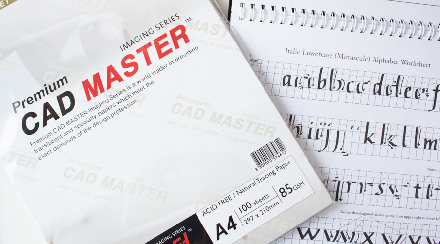
When I was a complete beginner, I went and bought some tracing paper and used it to practice training wheel style.
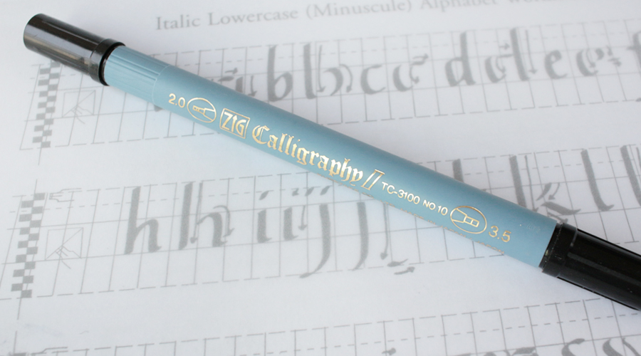
Here I’ve placed the tracing paper on top of the page, and you can see the page underneath! So I used washi tape to keep it fixed in place, and used a ZIG Calligraphy double sided marker to trace the strokes.
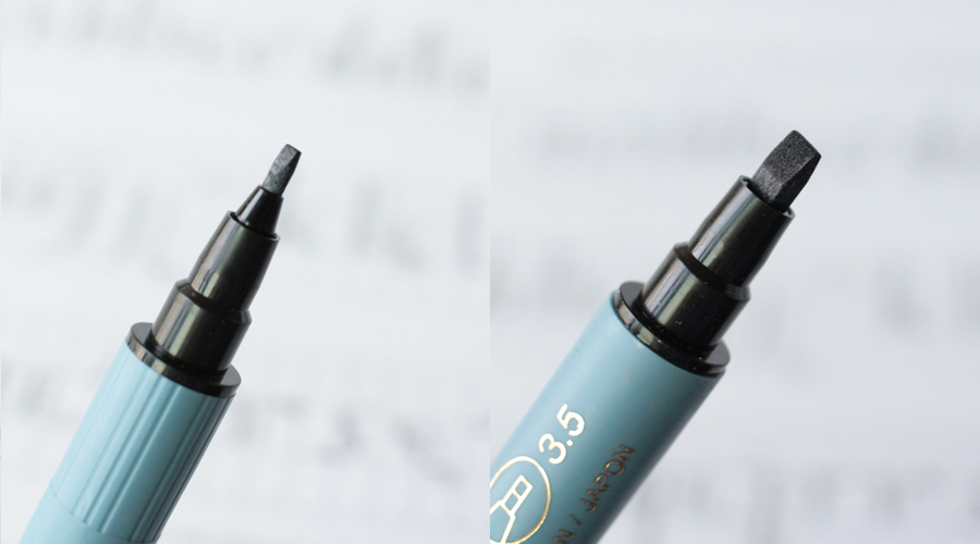
One side is 2mm and the other is 3.5mm. For this book you only need to use the 2mm side of the marker.
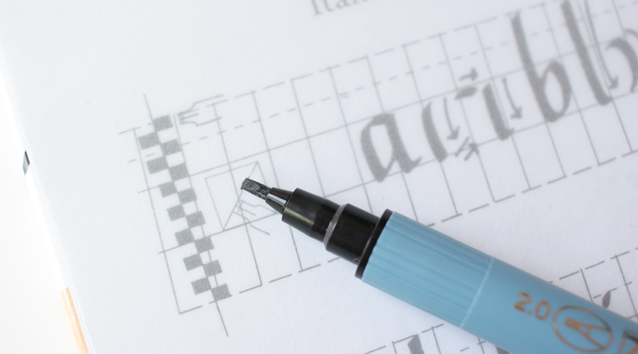
First, I line up the edge of the nib to the angle checker on the left. That’s the angle I want to hold the nib at so that the letters that I write will have that slanted shape.
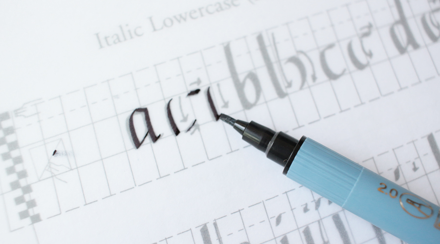
This is just a super easy way to get comfortable with the order of the strokes, and get a feel for how to write the letters without feeling discouraged. My first attempts with Italics never looked right because I didn’t know that I needed to use a guideline and a lot of other books may mention somewhere in the introduction that guidelines are helpful but don’t show them when they’re explaining the letters. So for the longest time I could not figure out how I was ever going to make the letters look right, and I quit a few times along the way. It wasn’t until I used this book that everything sort of clicked and I learned how important guidelines were! Of course, you can draw your own guidelines, or find them online, but I think this book is totally worth getting with the way it breaks down all the letters.
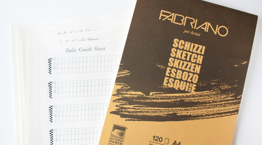
Once you’re ready to actually use a dip pen with ink, you’ll need some paper that won’t make the ink bleed all over the place. You also need paper that is smooth enough that the nib doesn’t catch on all the fibers. People recommend the Canson Marker pad, but I haven’t tried that one yet. I’ve been loving this Fabriano per Artisti 90g paper because it includes 120 sheets of paper. So you get a lot more paper for a similar price. The only downside, which is not necessarily a downside, is that the paper isn’t completely white. It’s more of an ivory white. It doesn’t bother me at all and I prefer to have a lot of paper that I can practice heaps on, than expensive paper that I’m going to worry about wasting. I scanned the guide sheet that came with the book and print it onto the sketchbook paper. At first I used my makeshift lightbox and just put the guidesheet under the paper, but I rather like having the guidelines on the paper so I can go back and self-critique my work afterwards.
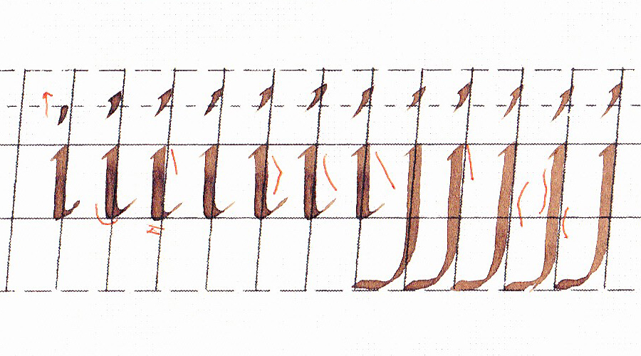
This is from my 8th page of practicing the letters i, j, l, t, and f. As you can see, I’ve marked up the mistakes I’ve made with a pen. To give you an idea of how much progress I’ve made, I’ll show you an example from my first page of practicing these letters:

So this is from before I started printing my guidelines on to the sheet. So it’s harder to self critique in terms of angels and the height of the letters and such. I was having trouble adjusting the ink, and my dots looked like giant blobs. A lot of my lines don’t look very clean because I was still trying to figure out how to control the pressure I was putting on the nib. If you compare it with my 8th page that I showed above, you can see that it’s a lot easier to critique your work when you see the guidelines with the letters. So I highly recommend printing the guidelines on your paper when you’re first starting out!

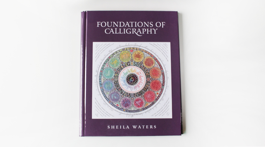
The second book I have to recommend is Foundations of Calligraphy by Sheila Waters. I don’t recommend this book to complete beginners because it’s not exactly a step-by-step kind of book. This book is for people who have dabbled in square edged nib calligraphy for a bit and have decided that they want to learn it in depth.
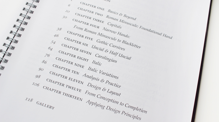
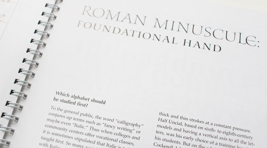
What’s wonderful about this book is that it gives an overview of the different calligraphic hands (fonts) including it’s history, and lots of useful information such as which one you should start with first.
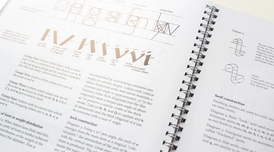
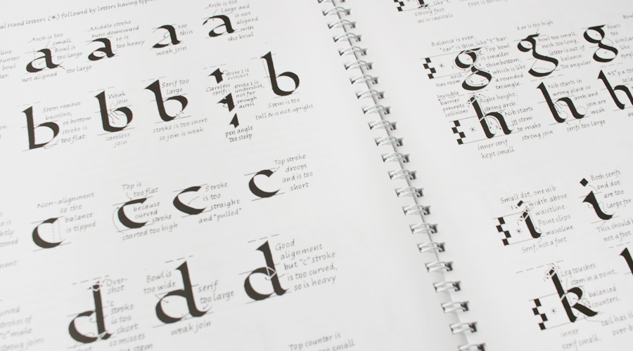
If you’ve been craving diagrams and analysis as well as troubleshooting for your letters that look a bit off, this book is for you. It’s a bit expensive, especially if you have to pay for international shipping, but this book is completely worth every penny. In fact, if you already have an idea of what order the letters are written in, and know how draw your own guidelines then get this book. It will cover the fundamentals of the letters that will make light bulbs blink frantically above your head while you’re reading it! This book answered my question of why Italic looks deceptively simple but is difficult to learn, and why every book has a different way of writing it.
Your Turn ♥ Have you ever tried to learn Italic or Gothic before?
